If you haven’t noticed that social media has gone visual, then what the hell have you been looking at?
Of course, blogs and articles such as this are still extremely important for engagement and for adding value to your website and brand, but, amidst all the literary wizardry and great advice, you need something to grab your followers’ attention every once in a while – and that feat is often no better achieved than with a super-snazzy infographic.
Why We Love Infographics
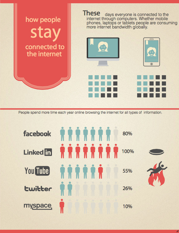
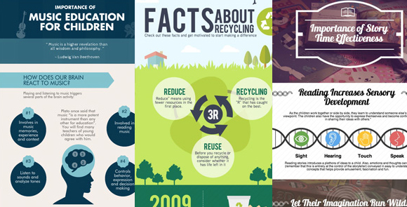
Infographics are firm favourites for users. They have, as their name suggests, the best of two worlds – information and graphics.
It’s no secret that most of us are best engaged through visual means. Do you remember at school how much more our attentions were held when we got to watch a video rather than having to read yet another chapter of text?
Hopefully by now most of our concentration spans will have sophisticated somewhat, but in a world where everyone is online, browsing social media all of the time, what do you think is more eye-catching – another blog post, or a colourful infographic?
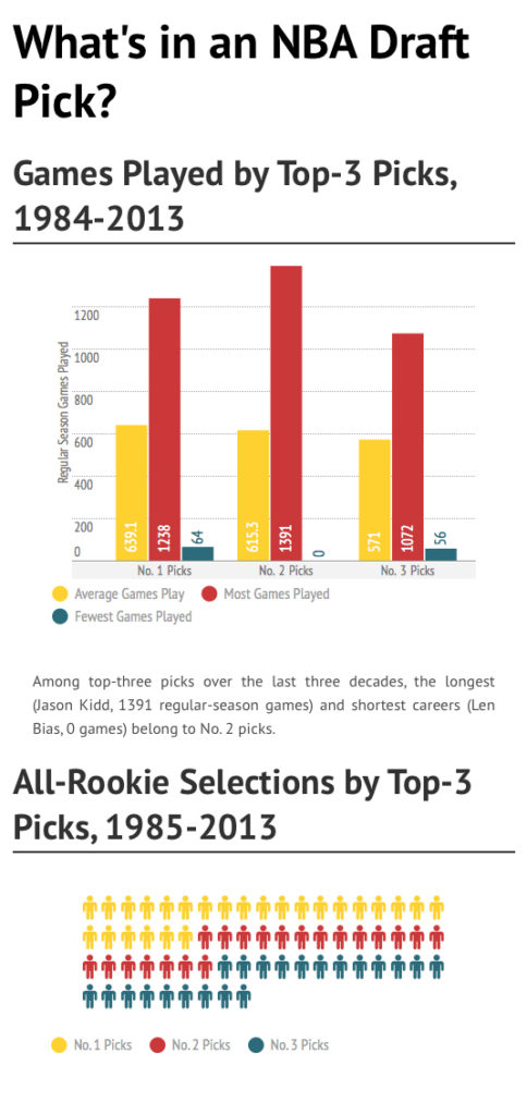
Everyone loves factoids and statistics – and it is on infographics that these reign supreme. What’s more, these little nuggets of information are articulated not only textually but graphically as well, making the info sink into the consumer’s mind.
If you want to dazzle your following, or even impress the board members with how well your Twitter following is engaging, then create a quick infographic – you’ll say more in one image than what it would take a few hundred words to write.
And this is an important distinction. Infographics do not contain in-depth analyses of markets, growth figures or anything else. They are simply bite-sized facts that can be consumed in a mouthful.
Creating Infographics
Professional graphic designers will charge you an arm and a leg for producing an infographic from scratch. Although these will almost certainly be one of the better ones that you will see floating around the web, if you simply can’t budget for such an endeavour, then lack of funds doesn’t have to be the reason why you don’t jump aboard the band wagon.
And neither should lack of skills or software stop you. There was a time when to create an infographic you had to practically have the whole Adobe Creative Suite installed on your computer – and then spend a fortune trying to educate yourself on how to use it.
Thankfully, those days are long gone, for there are many tools that are available on the web that you can use for nothing to start building your own infographics.
Many of these work on a template basis, which means that half the work has already been done for you. You will still have control over all the headings and images that you use (and there will be a free image bank that accompanies each tool), and the colour scheme, the design, the format and the layout will still be left all up to you. Indeed, in some cases you don’t even have to use a template at all, but can simply start from scratch and allow the tool to intuitively take you through the process of infographic creation.
So, which ones are the best?
By all means we encourage you experiment with as many as you like, but here is our top three in no particular order:
Top 3 Free Tools For Making Amazing Infographics
#1. Easel.ly
Easel.ly is a great starter tool, filled with lots of vector images and things like arrows and graphs that can be made with just a few clicks. If you’re not satisfied with the images in the image bank, then Easle.ly lets you upload your own, and there’s a whole range of templates, fonts, colours, text sizes and styles to choose from. A good choice for the novice.
#2. Piktochart
Piktochart is also a very popular free online tool – though if you want access to the really cool stuff then it will cost you $29 a month or $169 a year for a pro account.
You are presented with a different array of fonts, images, themes and colour schemes than Easel.ly, though essentially the 2 tools do the same thing. So in the end it will just come down to matters of preference between these two.
#3. Infogr.am
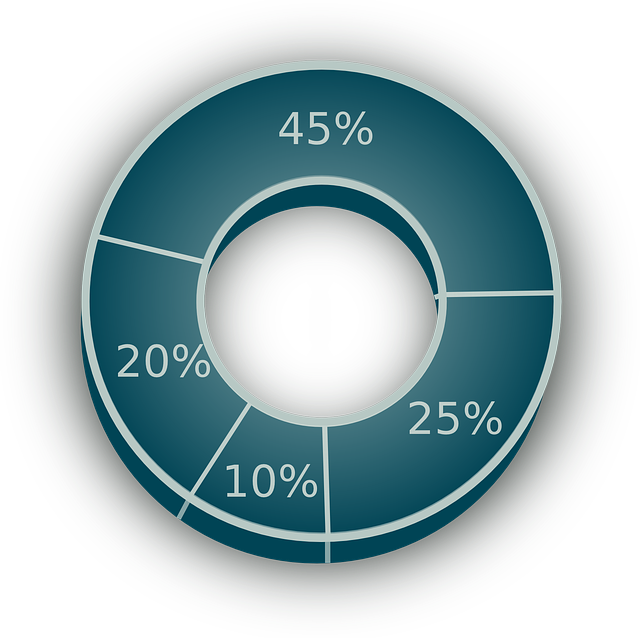
The main focus of Infogr.am is to create beautifully visualized online graphs and charts, so perhaps the best one to use if you need something to liven up those weekly report figures.
All you have to do is insert whatever data it is that you have into an Excel-style spreadsheet, click the button and watch your statistics become visual. Now all you need to do is embed the infographic in your website and share it across social media. Simple.
It comes with a 30-day free trial, after which you can pay anything between $15 and $166 a month to access all of the tool’s functions and features.
Did your favourite free infographic tool get a mention? Please share your thoughts in the comments below.
Get more leads, make more sales, grow your brand faster.


