In today’s digitally-driven marketplace, having a strong online presence is more important than ever. But what’s the point of drawing traffic to your website if it’s not converting? The answer lies in high-converting landing pages. A well-crafted landing page can be the difference between a casual visitor and a committed customer. In this article, we delve deep into the essentials for building landing pages that not only attract but also convert.
Why High-Converting Landing Pages Matter
Before we jump into the tips, let’s address the elephant in the room—why should you care about high-converting landing pages? In essence, a landing page serves as a digital storefront. Just like how a compelling window display can lure in shoppers, an engaging landing page can attract potential customers. The ultimate aim is conversion, be it making a purchase, signing up for a newsletter, or any other action beneficial to your business.
Tip 1: Craft a Killer Headline ?
The Importance of First Impressions
A headline is the first thing your visitor sees and therefore, your first opportunity to impress. In a world plagued by dwindling attention spans, you have just a few seconds to capture interest.
Do’s:
Unlock Your Full Potential with Our New Course!
This headline is not only clear but also taps into the aspirations of the visitor.
Save Time and Money with Our All-in-One Solution.
This headline provides a straightforward benefit that anyone can appreciate.
Boost Your Leads by 300% in 30 Days!
Who wouldn’t be intrigued by such a promising proposition?
Don’ts:
Get Better Results with Us!
Too vague to be compelling.
We’re the Best in the Business!
Boastful and lacks specificity.
Something Awesome Awaits You!
Again, vagueness is not your friend when it comes to headlines.
Tip 2: Develop a Compelling CTA ?
What Makes a Good CTA?
The Call-to-Action (CTA) is the ‘next step’ you wish your visitor to take. It should be as irresistible as a well-prepared dessert menu. Here’s some more great CTA’s you can’t help but click.
Do’s:
Use clear and specific language:
‘Buy Now’, ‘Sign Up’, and ‘Learn More’ are excellent examples.
Use action verbs and create urgency:
‘Get Started Today’, ‘Limited Time Offer’.
Be smart about colour:
Psychology suggests that colours like red and green are more attention-grabbing.
Leverage design:
Place your CTA button where it can’t be missed.
Don’ts:
Too many CTAs:
Don’t overwhelm your visitors.
Unclear or wrong value:
Don’t promise what you can’t deliver.
Hard to find CTAs:
Make it prominent.
Not optimised for mobile:
In 2023, mobile compatibility is non-negotiable.
Tip 3: Implement Eye-Catching Visuals ?️
Why Visuals Matter
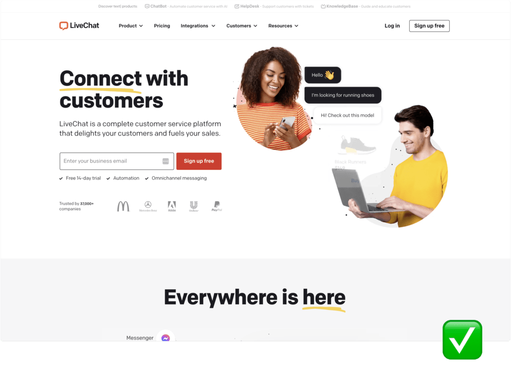
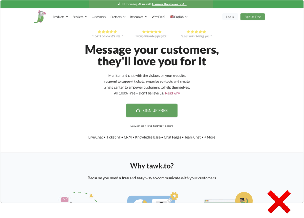
People are visually driven creatures. The right images or videos can dramatically improve engagement.
Do’s:
Don’ts:
Tip 4: Harness the Power of Social Proof ?
The Credibility Factor
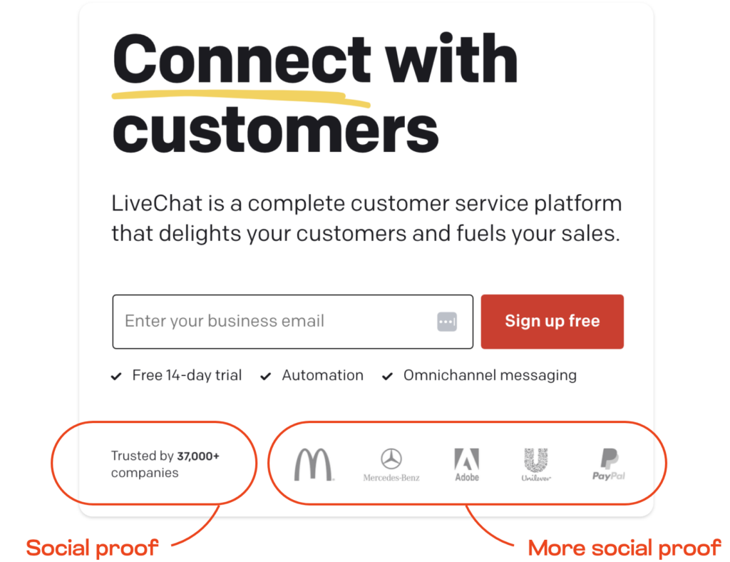
If you’ve got glowing testimonials or notable endorsements, flaunt them. Social proof can tip the scales in your favour significantly.
Do’s:
Tip 5: Prioritise Mobile Responsiveness ?
Why Mobile-First?
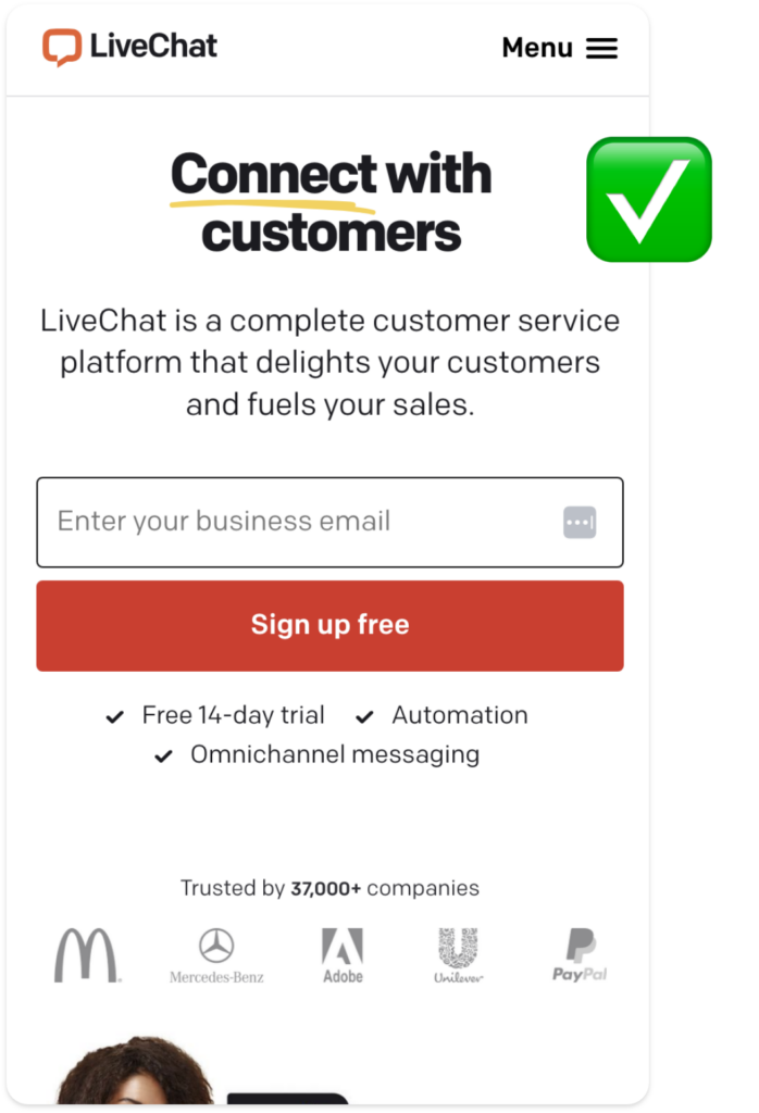
We live in a mobile-first world. A landing page that doesn’t look or function well on mobile is a conversion killer.
Do’s:
Your Turn! ?♀️?♂️
Creating high-converting landing pages is both an art and a science. With the innovations of tech there’s plenty of tools out there to build winning landing pages. While it’s essential to follow best practices, don’t be afraid to test new strategies and make adjustments based on your audience’s response. What challenges have you faced with landing pages? Share your experiences and let’s learn together.
In summary, a high-converting landing page requires a killer headline, a compelling CTA, eye-catching visuals, social proof, and must be mobile-responsive. Employ these tips and watch your conversion rate soar. Happy converting!
Get more leads, make more sales, grow your brand faster.
